Note
-
Download Jupyter notebook:
https://docs.doubleml.org/stable/examples/learners/py_tabpfn.ipynb.
Python: Causal Machine Learning with TabPFN#
In this example, we demonstrate how to use TabPFN (Tabular Prior-data Fitted Network) as a machine learning estimator within the DoubleML framework for causal inference. We compare TabPFN’s performance against (untuned) traditional machine learning methods including Random Forest, Linear models, and LightGBM.
TabPFN is a foundation model specifically designed for tabular data that can perform inference without traditional training. It leverages a transformer architecture trained on a vast collection of synthetic tabular datasets, making it particularly effective for small to medium-sized datasets commonly encountered in causal inference applications.
We will estimate Average Potential Outcomes (APOs) using the DoubleMLAPOS model, which allows us to estimate:
for different treatment levels \(d\) in a discrete treatment setting.
Imports and Setup#
We start by importing the necessary libraries. Note that TabPFN requires a separate installation, see documentation.
For GPU acceleration (recommended), ensure you have CUDA-enabled PyTorch installed. Instead you can also use the TabPFN API Client.
[1]:
import numpy as np
import pandas as pd

import matplotlib.pyplot as plt
import seaborn as sns
import time

from sklearn.ensemble import RandomForestRegressor, RandomForestClassifier
from sklearn.linear_model import LinearRegression, LogisticRegression
import lightgbm as lgbm
from tabpfn import TabPFNRegressor, TabPFNClassifier
from tabpfn.constants import ModelVersion

import doubleml as dml
from doubleml.irm.datasets import make_irm_data_discrete_treatments

import warnings
warnings.filterwarnings("ignore", message="Running on CPU*", category=UserWarning, module="tabpfn")
warnings.filterwarnings("ignore", message=".*does not have valid feature names.*", category=UserWarning)
Data Generating Process (DGP)#
We generate synthetic data using DoubleML’s discrete treatment data generating process. This creates:
A continuous treatment variable that is subsequently discretized into multiple levels \(D\)
True individual treatment effects (ITEs) for comparison with our estimates
Covariates \(X\) that affect both treatment assignment \(D\) and outcomes \(Y\)
The discretization allows us to compare estimated Average Potential Outcomes (APOs) and Average Treatment Effects (ATEs) against their true values, providing a clear benchmark for evaluating different machine learning methods. For more details on the data generating process and the APO model, we refer to the APO Model Example Notebook.
[2]:
# Parameters
n_obs = 1000
n_levels = 5
linear = False
n_rep = 1

np.random.seed(42)
data_apo = make_irm_data_discrete_treatments(n_obs=n_obs, n_levels=n_levels, linear=linear)

y0 = data_apo['oracle_values']['y0']
cont_d = data_apo['oracle_values']['cont_d']
ite = data_apo['oracle_values']['ite']
d = data_apo['d']
potential_level = data_apo['oracle_values']['potential_level']
level_bounds = data_apo['oracle_values']['level_bounds']

average_ites = np.full(n_levels + 1, np.nan)
apos = np.full(n_levels + 1, np.nan)
mid_points = np.full(n_levels, np.nan)

for i in range(n_levels + 1):
    average_ites[i] = np.mean(ite[d == i]) * (i > 0)
    apos[i] = np.mean(y0) + average_ites[i]

print(f"Average treatment effects in each group:\n{np.round(average_ites,2)}\n")
print(f"Average potential outcomes in each group:\n{np.round(apos,2)}\n")
print(f"Levels and their counts:\n{np.unique(d, return_counts=True)}")
Average treatment effects in each group:
[ 0.    1.46  6.67  9.31 10.36 10.47]

Average potential outcomes in each group:
[209.9  211.36 216.56 219.2  220.26 220.37]

Levels and their counts:
(array([0., 1., 2., 3., 4., 5.]), array([183, 165, 154, 162, 175, 161]))
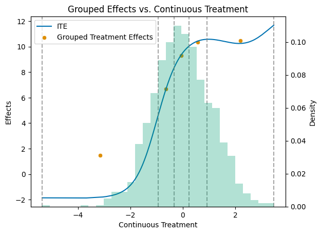
Visualizing the Treatment Effect Structure#
To better understand our data, let’s visualize the relationship between the continuous treatment variable and the individual treatment effects, along with how the treatment is discretized into levels.
[3]:
# Get a colorblind-friendly palette
palette = sns.color_palette("colorblind")

df = pd.DataFrame({'cont_d': cont_d, 'ite': ite})
df_sorted = df.sort_values('cont_d')

mid_points = np.full(n_levels, np.nan)
for i in range(n_levels):
    mid_points[i] = (level_bounds[i] + level_bounds[i + 1]) / 2

df_apos = pd.DataFrame({'mid_points': mid_points, 'treatment effects': apos[1:] - apos[0]})

# Create the primary plot with scatter and line plots
fig, ax1 = plt.subplots()

sns.lineplot(data=df_sorted, x='cont_d', y='ite', color=palette[0], label='ITE', ax=ax1)
sns.scatterplot(data=df_apos, x='mid_points', y='treatment effects', color=palette[1], label='Grouped Treatment Effects', ax=ax1)

# Add vertical dashed lines at level_bounds
for bound in level_bounds:
    ax1.axvline(x=bound, color='grey', linestyle='--', alpha=0.7)

ax1.set_title('Grouped Effects vs. Continuous Treatment')
ax1.set_xlabel('Continuous Treatment')
ax1.set_ylabel('Effects')

# Create a secondary y-axis for the histogram
ax2 = ax1.twinx()

# Plot the histogram on the secondary y-axis
ax2.hist(df_sorted['cont_d'], bins=30, alpha=0.3, weights=np.ones_like(df_sorted['cont_d']) / len(df_sorted['cont_d']), color=palette[2])
ax2.set_ylabel('Density')

# Make sure the legend includes all plots
lines, labels = ax1.get_legend_handles_labels()
ax1.legend(lines, labels, loc='upper left')

plt.show()
Creating the DoubleMLData Object#
As with all DoubleML models, we need to create a DoubleMLData object to properly structure our data for causal inference. This object handles the separation of outcome variables, treatment variables, and covariates.
[4]:
y = data_apo['y']
x = data_apo['x']
d = data_apo['d']
df_apo = pd.DataFrame(
    np.column_stack((y, d, x)),
    columns=['y', 'd'] + ['x' + str(i) for i in range(data_apo['x'].shape[1])]
)

dml_data = dml.DoubleMLData(df_apo, 'y', 'd')
print(dml_data)
================== DoubleMLData Object ==================

------------------ Data summary      ------------------
Outcome variable: y
Treatment variable(s): ['d']
Covariates: ['x0', 'x1', 'x2', 'x3', 'x4']
Instrument variable(s): None
No. Observations: 1000

------------------ DataFrame info    ------------------
<class 'pandas.core.frame.DataFrame'>
RangeIndex: 1000 entries, 0 to 999
Columns: 7 entries, y to x4
dtypes: float64(7)
memory usage: 54.8 KB
DoubleML with TabPFN#
The TabPFN package integrates seamlessly with the DoubleML framework for causal inference tasks.
For fitting average potential outcome models, the DoubleML interface requires to specify the ml_g and ml_m learners:
ml_g: A regressor for the outcome model \(g_0(D,X) = \mathbb{E}[Y|X,D]\)ml_m: A classifier for the propensity score model \(m_{0,d}(X) = \mathbb{E}[1\{D=d\}|X]\)
Note: TabPFN works best with CUDA acceleration. If CUDA is not available, it will fall back to CPU computation. Instead you can use TabPFN API Client.
[5]:
device = 'cpu'
ml_g = TabPFNRegressor.create_default_for_version(ModelVersion.V2, device=device, random_state=42)
ml_m = TabPFNClassifier.create_default_for_version(ModelVersion.V2, device=device, random_state=42)
To model average potential outcomes, we initialize the DoubleMLAPOS object with the specified machine learning methods and treatment levels.
[6]:
treatment_levels = np.unique(dml_data.d)
dml_obj = dml.DoubleMLAPOS(
    dml_data,
    ml_g=ml_g,
    ml_m=ml_m,
    treatment_levels=treatment_levels,
    n_rep=n_rep,
)
As usual, you can estimate the parameters by calling the fit method on the dml_obj instance.
[7]:
dml_obj.fit()
print(dml_obj)
================== DoubleMLAPOS Object ==================

------------------ Fit summary       ------------------
           coef   std err           t  P>|t|       2.5 %      97.5 %
0.0  209.309952  1.208485  173.200225    0.0  206.941364  211.678540
1.0  210.984368  1.359622  155.178751    0.0  208.319559  213.649177
2.0  216.506080  1.265888  171.030964    0.0  214.024985  218.987175
3.0  219.259184  1.316197  166.585402    0.0  216.679486  221.838883
4.0  219.891299  1.279140  171.905612    0.0  217.384232  222.398367
5.0  219.380538  1.195920  183.440790    0.0  217.036577  221.724498
Machine Learning Methods Comparison#
We compare four different machine learning approaches for estimating the nuisance functions in our causal model:
Random Forest
Linear Models
Boosted Trees (LightGBM)
Foundation Model (TabPFN)
Remark that we did not tune the machine learning models in detail.
[8]:
rf_arguments = {
    'n_estimators': 500,
    'min_samples_leaf': 10,
    'random_state': 42
}

lgbm_arguments = {
    'n_estimators': 500,
    'learning_rate': 0.01,
    'max_depth': 3,
    'min_data_in_leaf': 10,
    'lambda_l1': 1,
    'lambda_l2': 2,
    'random_state': 42,
    'verbose': -1,
}
[9]:
learner_dict = {
    'RandomForest': {
        'ml_g': RandomForestRegressor(**rf_arguments),
        'ml_m': RandomForestClassifier(**rf_arguments)
    },
    'Linear': {
        'ml_g': LinearRegression(),
        'ml_m': LogisticRegression(max_iter=1000)
    },
    'LightGBM': {
        'ml_g': lgbm.LGBMRegressor(**lgbm_arguments),
        'ml_m': lgbm.LGBMClassifier(**lgbm_arguments)
    },
    'TabPFN': {
        'ml_g': TabPFNRegressor.create_default_for_version(ModelVersion.V2, device=device, random_state=42),
        'ml_m': TabPFNClassifier.create_default_for_version(ModelVersion.V2, device=device, random_state=42)
    }
}
Estimation of Average Potential Outcomes#
Now we estimate the Average Potential Outcomes (APOs) for each treatment level using all four machine learning methods. We use the DoubleMLAPOS class, which:
Estimates nuisance functions: Uses cross-fitting to estimate \(g_0(D,X)\) and \(m_{0,d}(X)\)
Computes APO estimates: Uses the efficient influence function to estimate \(\theta_d = \mathbb{E}[Y(d)]\)
Provides confidence intervals: Based on the asymptotic distribution of the estimator
We also compute causal contrasts (Average Treatment Effects) as differences between treatment levels and the reference level (no treatment).
[10]:
reference_level = 0

apo_results = []
causal_contrast_results = []
model_list = []

for learner_name, learner_pair in learner_dict.items():
    print(f"\n{'='*60}")
    print(f"Fitting model: {learner_name}")
    print(f"{'='*60}")

    start_time = time.time()

    dml_obj = dml.DoubleMLAPOS(
        dml_data,
        learner_pair['ml_g'],
        learner_pair['ml_m'],
        treatment_levels=treatment_levels,
        n_rep=n_rep,
    )
    dml_obj.fit()

    end_time = time.time()
    elapsed_time = end_time - start_time

    print(f"{learner_name} fitted in {elapsed_time:.2f} seconds")

    model_list.append(dml_obj)

    # APO confidence intervals
    ci_pointwise = dml_obj.confint(level=0.95)
    df_apos = pd.DataFrame({
        'learner': learner_name,
        'treatment_level': treatment_levels,
        'apo': dml_obj.coef,
        'ci_lower': ci_pointwise.values[:, 0],
        'ci_upper': ci_pointwise.values[:, 1]}
    )
    apo_results.append(df_apos)

    # ATE confidence intervals
    causal_contrast_model = dml_obj.causal_contrast(reference_levels=reference_level)
    ates = causal_contrast_model.thetas
    ci_ates = causal_contrast_model.confint(level=0.95)
    df_ates = pd.DataFrame({
        'learner': learner_name,
        'treatment_level': treatment_levels[1:],
        'ate': ates,
        'ci_lower': ci_ates.iloc[:, 0].values,
        'ci_upper': ci_ates.iloc[:, 1].values
    })
    causal_contrast_results.append(df_ates)

# Combine all results
df_all_apos = pd.concat(apo_results, ignore_index=True)
df_all_ates = pd.concat(causal_contrast_results, ignore_index=True)
df_all_ates
============================================================
Fitting model: RandomForest
============================================================
RandomForest fitted in 46.82 seconds

============================================================
Fitting model: Linear
============================================================
Linear fitted in 0.11 seconds

============================================================
Fitting model: LightGBM
============================================================
LightGBM fitted in 3.12 seconds

============================================================
Fitting model: TabPFN
============================================================
TabPFN fitted in 183.38 seconds
[10]:
| learner | treatment_level | ate | ci_lower | ci_upper | |
|---|---|---|---|---|---|
| 0 | RandomForest | 1.0 | 2.253828 | -2.699097 | 7.206752 |
| 1 | RandomForest | 2.0 | 7.498048 | 2.237756 | 12.758340 |
| 2 | RandomForest | 3.0 | 11.756539 | 6.289006 | 17.224073 |
| 3 | RandomForest | 4.0 | 7.678953 | 2.767027 | 12.590880 |
| 4 | RandomForest | 5.0 | 6.865101 | 0.994615 | 12.735587 |
| 5 | Linear | 1.0 | 3.932233 | -1.962948 | 9.827414 |
| 6 | Linear | 2.0 | 8.720447 | 3.747057 | 13.693837 |
| 7 | Linear | 3.0 | 10.625888 | 6.871080 | 14.380695 |
| 8 | Linear | 4.0 | 11.339177 | 7.917038 | 14.761317 |
| 9 | Linear | 5.0 | 8.254858 | 4.324910 | 12.184806 |
| 10 | LightGBM | 1.0 | 1.276002 | -4.056172 | 6.608177 |
| 11 | LightGBM | 2.0 | 6.166088 | 1.817977 | 10.514199 |
| 12 | LightGBM | 3.0 | 10.974491 | 6.011016 | 15.937967 |
| 13 | LightGBM | 4.0 | 9.726078 | 5.797966 | 13.654191 |
| 14 | LightGBM | 5.0 | 8.085730 | 3.570351 | 12.601109 |
| 15 | TabPFN | 1.0 | 1.621060 | 0.289549 | 2.952572 |
| 16 | TabPFN | 2.0 | 7.064673 | 6.089229 | 8.040118 |
| 17 | TabPFN | 3.0 | 10.021728 | 8.609947 | 11.433509 |
| 18 | TabPFN | 4.0 | 10.454991 | 9.231879 | 11.678104 |
| 19 | TabPFN | 5.0 | 9.751194 | 8.762049 | 10.740339 |
Visualizing Average Potential Outcomes#
Let’s compare the estimated APOs across all methods with their true values. The plot shows:
Estimated APOs: Point estimates with 95% confidence intervals for each method
True APOs: Red horizontal lines showing the oracle values
Treatment levels: Different dosage levels of the treatment (0 = no treatment)
[11]:
# Plot APOs and 95% CIs for all models
plt.figure(figsize=(12, 7))
palette = sns.color_palette("colorblind")
learners = df_all_apos['learner'].unique()
n_learners = len(learners)
jitter_strength = 0.12

for i, learner in enumerate(learners):
    df = df_all_apos[df_all_apos['learner'] == learner]
    # Jitter x positions for each learner
    jitter = (i - (n_learners - 1) / 2) * jitter_strength
    x_jittered = df['treatment_level'] + jitter
    plt.errorbar(
        x_jittered,
        df['apo'],
        yerr=[df['apo'] - df['ci_lower'], df['ci_upper'] - df['apo']],
        fmt='o',
        capsize=5,
        capthick=2,
        ecolor=palette[i % len(palette)],
        color=palette[i % len(palette)],
        label=f"{learner} APO ±95% CI",
        zorder=2
    )

# Get treatment levels for proper line positioning
treatment_levels_plot = sorted(df_all_apos['treatment_level'].unique())
x_range = plt.xlim()
total_width = x_range[1] - x_range[0]

# Add true APOs as red horizontal lines
for i, level in enumerate(treatment_levels_plot):
    # Center each line around its treatment level with a reasonable width
    line_width = 0.6  # Width of each horizontal line relative to treatment level spacing
    x_center = level
    x_start = x_center - line_width/2
    x_end = x_center + line_width/2

    # Convert to relative coordinates (0-1) for xmin/xmax
    xmin_rel = max(0, (x_start - x_range[0]) / total_width)
    xmax_rel = min(1, (x_end - x_range[0]) / total_width)

    plt.axhline(y=apos[int(level)], color='red', linestyle='-', alpha=0.7,
                xmin=xmin_rel, xmax=xmax_rel,
                linewidth=3, label='True APO' if i == 0 else "")

plt.title('Estimated APO and 95% Confidence Interval by Treatment Level')
plt.xlabel('Treatment Level')
plt.ylabel('Average Potential Outcome (APO)')
plt.xticks(sorted(df_all_apos['treatment_level'].unique()))
plt.legend()
plt.grid(True)
plt.show()
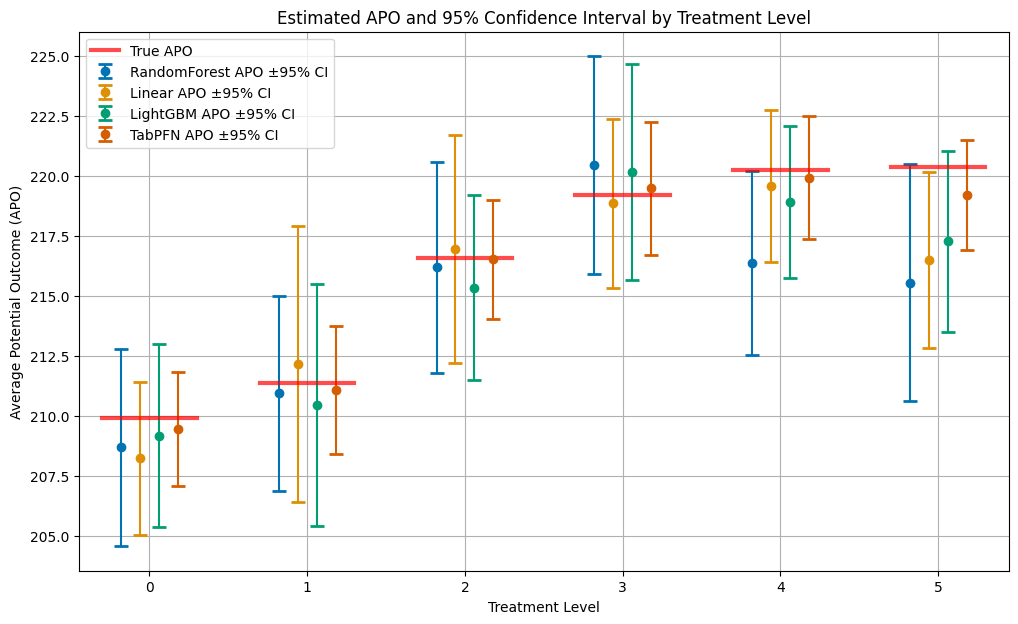
It is quite clear to see, that without tuning the hyperparameters of the models, the TabPFN model achieves the best performance (smallest confidence intervals) across all treatment levels.
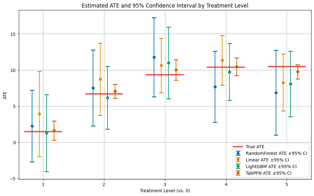
Visualizing Average Treatment Effects#
Now let’s examine the Average Treatment Effects (ATEs), which represent the causal effect of each treatment level compared to the reference level (no treatment). The ATE for treatment level \(d\) is defined as:
[12]:
# Plot ATEs and 95% CIs for all models
plt.figure(figsize=(12, 7))
palette = sns.color_palette("colorblind")
learners = df_all_ates['learner'].unique()
n_learners = len(learners)
jitter_strength = 0.12

for i, learner in enumerate(learners):
    df = df_all_ates[df_all_ates['learner'] == learner]
    # Jitter x positions for each learner
    jitter = (i - (n_learners - 1) / 2) * jitter_strength
    x_jittered = df['treatment_level'] + jitter
    plt.errorbar(
        x_jittered,
        df['ate'],
        yerr=[df['ate'] - df['ci_lower'], df['ci_upper'] - df['ate']],
        fmt='o',
        capsize=5,
        capthick=2,
        ecolor=palette[i % len(palette)],
        color=palette[i % len(palette)],
        label=f"{learner} ATE ±95% CI",
        zorder=2
    )

# Get treatment levels for proper line positioning
treatment_levels_plot = sorted(df_all_ates['treatment_level'].unique())
x_range = plt.xlim()
total_width = x_range[1] - x_range[0]

# Add true ATEs as red horizontal lines
for i, level in enumerate(treatment_levels_plot):
    # Center each line around its treatment level with a reasonable width
    line_width = 0.6  # Width of each horizontal line relative to treatment level spacing
    x_center = level
    x_start = x_center - line_width/2
    x_end = x_center + line_width/2

    # Convert to relative coordinates (0-1) for xmin/xmax
    xmin_rel = max(0, (x_start - x_range[0]) / total_width)
    xmax_rel = min(1, (x_end - x_range[0]) / total_width)

    # Use average_ites[level] for the true ATE (treatment levels start from 1 for ATEs)
    plt.axhline(y=average_ites[int(level)], color='red', linestyle='-', alpha=0.7,
                xmin=xmin_rel, xmax=xmax_rel,
                linewidth=3, label='True ATE' if i == 0 else "")

plt.title('Estimated ATE and 95% Confidence Interval by Treatment Level')
plt.xlabel('Treatment Level (vs. 0)')
plt.ylabel('ATE')
plt.xticks(sorted(df_all_ates['treatment_level'].unique()))
plt.legend()
plt.grid(True)
plt.show()
Model Performance Evaluation#
To understand why different methods perform differently, let’s examine the performance of the underlying machine learning models used for the nuisance functions. DoubleML provides access to performance metrics for each component:
RMSE g0: Root Mean Square Error for the outcome model when treatment \(D \neq d\)
RMSE g1: Root Mean Square Error for the outcome model when treatment \(D = d\)
LogLoss m: Logarithmic loss for the propensity score model (treatment assignment prediction)
Better performance on these nuisance functions typically translates to more accurate causal estimates.
[13]:
# Create a comprehensive table with RMSE for g0, g1 and log loss for all learners and treatment levels
performance_results = []

for idx_learner, learner_name in enumerate(learner_dict.keys()):
    for idx_treat, treatment_level in enumerate(treatment_levels):
        # Get the specific model for this learner and treatment level
        model = model_list[idx_learner].modellist[idx_treat]

        # Extract performance metrics from nuisance_loss
        if model.nuisance_loss is not None:
            # RMSE for g0 (outcome model for treatment level != d)
            rmse_g0 = model.nuisance_loss['ml_g_d_lvl0'][0][0]

            # RMSE for g1 (outcome model for treatment level = d)
            rmse_g1 = model.nuisance_loss['ml_g_d_lvl1'][0][0]

            # Log loss for propensity score model
            logloss_m = model.nuisance_loss['ml_m'][0][0]
        else:
            rmse_g0 = rmse_g1 = logloss_m = None

        # Store results
        performance_results.append({
            'Learner': learner_name,
            'Treatment_Level': treatment_level,
            'RMSE_g0': rmse_g0,
            'RMSE_g1': rmse_g1,
            'LogLoss_m': logloss_m
        })

# Create DataFrame and display as a nicely formatted table
df_performance = pd.DataFrame(performance_results)

# Round values for better readability
df_performance['RMSE_g0'] = df_performance['RMSE_g0'].round(4)
df_performance['RMSE_g1'] = df_performance['RMSE_g1'].round(4)
df_performance['LogLoss_m'] = df_performance['LogLoss_m'].round(4)

print("\n\nRMSE g0 by Learner and Treatment Level:")
print("=" * 80)
pivot_rmse_g0 = df_performance.pivot(index='Learner', columns='Treatment_Level', values='RMSE_g0')
print(pivot_rmse_g0.to_string())

print("\n\nRMSE g1 by Learner and Treatment Level:")
print("=" * 80)
pivot_rmse_g1 = df_performance.pivot(index='Learner', columns='Treatment_Level', values='RMSE_g1')
print(pivot_rmse_g1.to_string())

print("\n\nLogLoss m by Learner and Treatment Level:")
print("=" * 80)
pivot_logloss = df_performance.pivot(index='Learner', columns='Treatment_Level', values='LogLoss_m')
print(pivot_logloss.to_string())
RMSE g0 by Learner and Treatment Level:
================================================================================
Treatment_Level      0.0      1.0      2.0      3.0      4.0      5.0
Learner
LightGBM         16.6043  12.6722  16.4420  16.1879  16.1063  16.3937
Linear           21.4232  17.3711  20.5572  21.3341  21.3044  21.3389
RandomForest     17.8429  14.2921  17.1360  17.0445  17.4103  17.7712
TabPFN            9.3977   2.8226   9.5238   9.4965   9.2663   9.2945


RMSE g1 by Learner and Treatment Level:
================================================================================
Treatment_Level      0.0      1.0      2.0      3.0      4.0      5.0
Learner
LightGBM         16.2032  30.3334  18.8350  16.5337  15.6930  13.1095
Linear           16.3087  29.3359  21.6232  17.8452  16.6807  14.6180
RandomForest     21.0889  31.6349  22.8979  20.8461  19.2861  17.7393
TabPFN            3.9209  15.6921   4.9981   7.4276   5.9365   3.2138


LogLoss m by Learner and Treatment Level:
================================================================================
Treatment_Level     0.0     1.0     2.0     3.0     4.0     5.0
Learner
LightGBM         0.4996  0.4506  0.4417  0.4663  0.4782  0.4302
Linear           0.4770  0.4391  0.4247  0.4450  0.4637  0.4234
RandomForest     0.5011  0.4401  0.4235  0.4649  0.4766  0.4344
TabPFN           0.4772  0.4348  0.4286  0.4481  0.4652  0.4218
Performance Summary and Insights#
Let’s summarize the average performance across all treatment levels to identify the best-performing methods:
[14]:
# Best performing learners for each metric
print("\nBest performing learners (averaged across treatment levels):")
print("-" * 60)

# Calculate average metrics across treatment levels for each learner
summary_stats = df_performance.groupby('Learner')[['RMSE_g0', 'RMSE_g1', 'LogLoss_m']].mean().round(4)
print(summary_stats)
Best performing learners (averaged across treatment levels):
------------------------------------------------------------
              RMSE_g0  RMSE_g1  LogLoss_m
Learner
LightGBM      15.7344  18.4513     0.4611
Linear        20.5548  19.4020     0.4455
RandomForest  16.9162  22.2489     0.4568
TabPFN         8.3002   6.8648     0.4460
Key Takeaways#
This example demonstrates several important findings about using TabPFN for causal inference.
Outcome modeling: TabPFN significantly outperforms traditional methods for both g0 and g1 functions, with much lower RMSE values
Causal estimates: The superior nuisance function performance translates to more accurate APO and ATE estimates
No hyperparameter tuning: TabPFN achieves these results without any model-specific tuning